sepiastars (![[personal profile]](https://www.dreamwidth.org/img/silk/identity/user.png) sepiastars) wrote2008-02-23 10:22 pm
sepiastars) wrote2008-02-23 10:22 pm
Entry tags:
texture use tutorial
Today we'll be learning how to use 2 different types of textures by way of making this:

Here's what we're making:

We'll start with opening our base texture, which is made byownthesunshine.
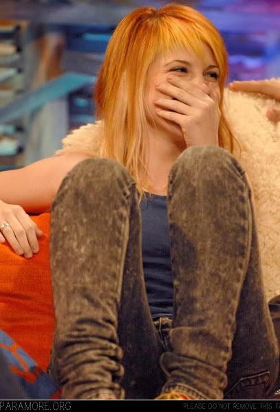
So Step One is to drag our original photo, which is from paramore.org, onto the base texture as a new layer, making sure that the left edge of the photo covers the ragged edge of the paper. Set this layer to Multiply. Now you can see the paper under Hayley's arm, and make sure the images line up correctly.
Step Two: Next, we'll color our original photo. Go to Select Layer > New Adjustment Layer > Selective Color and input the following values:
Reds:
C: -100
M: 0
Y: +62
K: +27
Yellows:
C: -59
M: 0
Y: +100
K: +50
Neutrals:
C: +48
M: 0
Y: -11
K: -7
Blacks:
C: 0
M: 0
Y: 0
K: +17
Now there are three layers on our layer palette: the base texture as the background layer, the photo of Hayley, and a selective coloring layer on the very top.
Step Three: Open this texture, also made byownthesunshine, and then drag it on top as a new layer. Make sure to only let it cover the part of the image with the photo of Hayley. Set this layer to Screen.
Step Four: Finally, we're going to add some text to the empty left side. Select the Text Tool from the tool palette. I thought a serif font would look nice, so I used DaunPenh in white. I had Robert Frost on the brain today, so I used one of his poems called "Into My Own," which I found here. It looked a little short, so I pasted it in the text box twice. I also pulled the left side of the box off of the left side of the image just to created a little more visual interest.
Step Five: Finally, merge all of your layers by selecting Layer > Flatten Image and save. And you're all done! A hint for beginners: save your graphics with a .png file extension as opposed to .jpg or .gif. The file takes up more space, but will look much better since it's less compressed.
Download the psd here if you're confused or lazy (no shame in that). Feel free to take the graphic and even edit it if you like, just please credit me for my work. And I'd love a comment to know that you like it or that you've taken it. I'd really appreciate it ^.^ Feel free to ask any questions you may have.
Here's what we're making:
We'll start with opening our base texture, which is made by
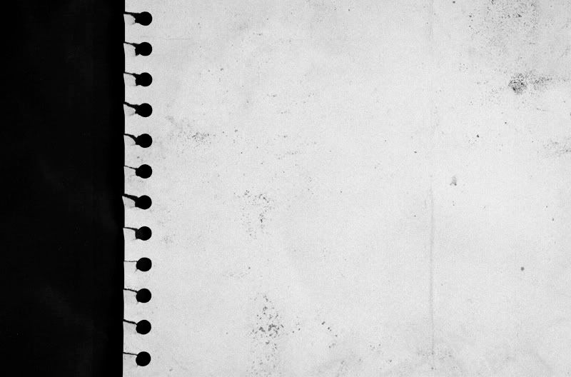
So Step One is to drag our original photo, which is from paramore.org, onto the base texture as a new layer, making sure that the left edge of the photo covers the ragged edge of the paper. Set this layer to Multiply. Now you can see the paper under Hayley's arm, and make sure the images line up correctly.
Step Two: Next, we'll color our original photo. Go to Select Layer > New Adjustment Layer > Selective Color and input the following values:
Reds:
C: -100
M: 0
Y: +62
K: +27
Yellows:
C: -59
M: 0
Y: +100
K: +50
Neutrals:
C: +48
M: 0
Y: -11
K: -7
Blacks:
C: 0
M: 0
Y: 0
K: +17
Now there are three layers on our layer palette: the base texture as the background layer, the photo of Hayley, and a selective coloring layer on the very top.
Step Three: Open this texture, also made by
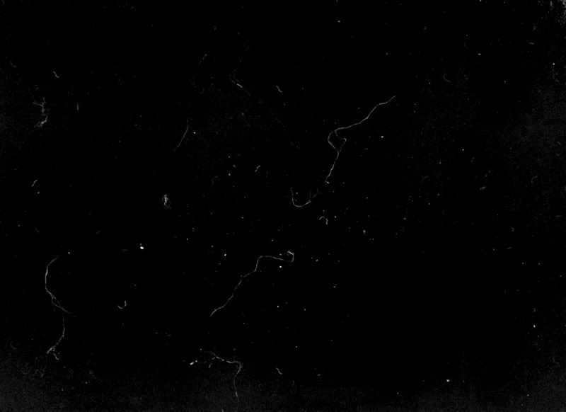
Step Four: Finally, we're going to add some text to the empty left side. Select the Text Tool from the tool palette. I thought a serif font would look nice, so I used DaunPenh in white. I had Robert Frost on the brain today, so I used one of his poems called "Into My Own," which I found here. It looked a little short, so I pasted it in the text box twice. I also pulled the left side of the box off of the left side of the image just to created a little more visual interest.
Step Five: Finally, merge all of your layers by selecting Layer > Flatten Image and save. And you're all done! A hint for beginners: save your graphics with a .png file extension as opposed to .jpg or .gif. The file takes up more space, but will look much better since it's less compressed.
Download the psd here if you're confused or lazy (no shame in that). Feel free to take the graphic and even edit it if you like, just please credit me for my work. And I'd love a comment to know that you like it or that you've taken it. I'd really appreciate it ^.^ Feel free to ask any questions you may have.